Project Overview
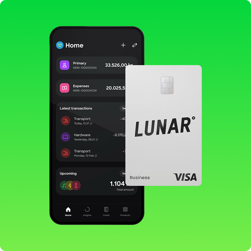
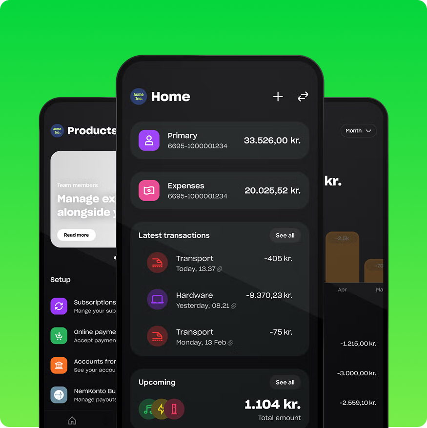
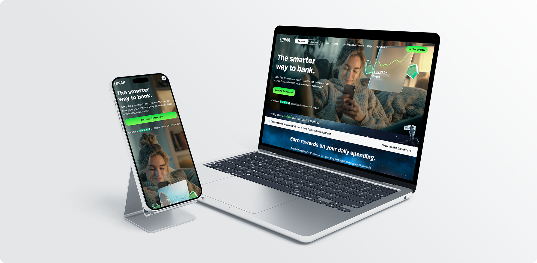
Lunar is a forward-thinking digital bank designed to help users take control of their finances through an intuitive, mobile-first experience. The project focused on revamping the Lunar website to align with its bold Scandinavian brand identity while ensuring top-notch performance, usability, and clarity across all pages—especially the Personal Banking section.
The redesign aimed to enhance user engagement, drive conversions, and present Lunar’s services in a more compelling and organized way for both new and returning users.
Project Scope & Objectives
- Full UI/UX design enhancement across the website
- Localization support, including image editing and layout adaptation for German and other regional versions.
- Consistency checks and layout refinements to match evolving brand guidelines A/B testing implementation to test visual hierarchy, image placement, and user interaction patterns
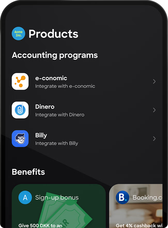
- Integration support for campaign-specific assets (e.g., Google Ads and blog content updates).
- Cross-device and cross-browser responsiveness testing
- Collaboration with development teams to ensure seamless deployment of updates

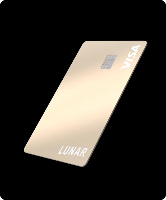

Lunar is an independent, regulated and licensed bank. Your money is protected by Danish deposit insurance. In other words, it’s safe with us.
More than 1,000,000 users in Denmark, Sweden and Norway use Lunar, including 25,000 entrepreneurs who use Lunar Business to manage their business finances.
Font Name :
SharpGrotesk
Sharp Grotesk is a versatile and modern sans-serif typeface designed by Lucas Sharp and released through Sharp Type. Here's a brief overview:
Combines the functionality of grotesque typefaces with a unique and expressive edge, offering both neutrality and character.
Ideal for branding, editorial design, tech interfaces, advertising, and anywhere a contemporary yet strong typographic voice is needed.
- A
- B
- C
- D
- E
- F
- G
- H
- I
- J
- K
- L
- M
- N
- O
- P
- Q
- R
- S
- T
Brand Colors
- #03D63D
- #7FF64D
- #000000
- #F2F2F2
Design & Development
Approach
The approach combined user-centric design principles with agile collaboration:
Discovery & Strategy
- Reviewed the existing website and identified gaps in layout flow, accessibility, and brand consistency
- Mapped user journeys to align content with user intent
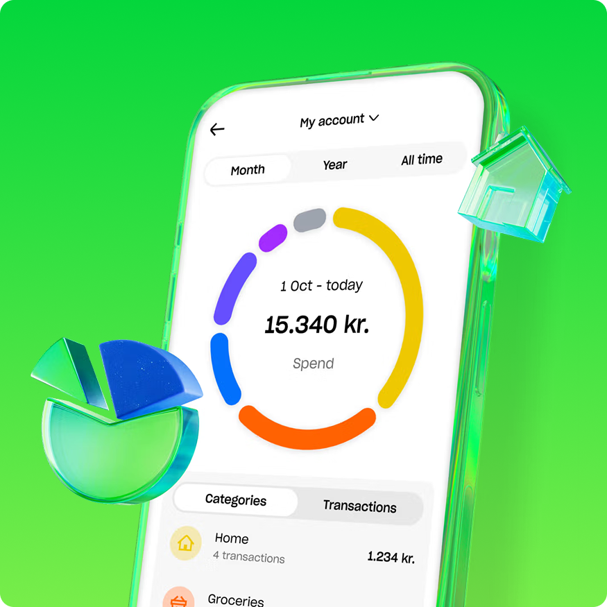
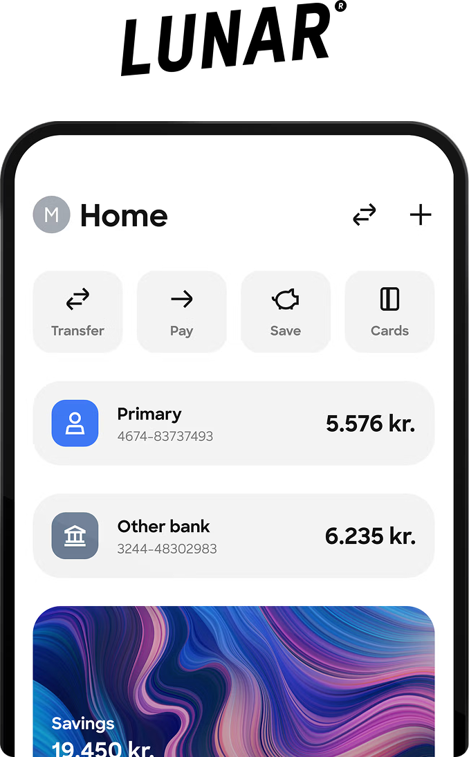
Visual Redesign
- Developed modern, clean UI components
- Optimized image placements and replaced regional content (e.g., German versions)
Performance & Testing
- Conducted A/B testing for image alignment and visual layouts.
- Optimized load times through image compression and asset refinement
- Ensured full responsiveness across all screen sizes
Collaboration & Iteration
- Worked closely with stakeholders for feedback integration
- Implemented feedback from cross-functional teams after review meetings
- Handed off assets with detailed specifications for development